
Our guide to colour calibration for photographers has been created to address a particular pain point experienced by photographersof all levels— getting what they see on their computer display to match their printed images.
When you take a moment to consider the two vastly different mediums, it’s easy to see why it’s unlikely that digital pixels on a computer display will closely match inks physically printed on photographic paper without some assistance. But as a professional printing lab, we understand this issue affects so many photographers and have looked to provide some hints and tips on colour management.
Why the mismatch?
The most readily apparent issue in output matching is brightness (gamma) and why inevitably some photographers will feel their prints appear ‘too dark’. This issue stems largely from the fact screens have internal backlighting, while physical prints rely completely on ambient light. In addition, the majority of monitors come from the manufacturer set too brightly for most home office and studio environments. This often leads us to incorrectly lower exposure values in photo editing programs to compensate, so the final image files we submit for printing are too dark.
Next there are colour temperature settings, sometimes called white points, that will affect the colour accuracy of your display, for example skin tones appearing too warm (too red) or cold (too blue).

The solution
So what’s a discerning photographer to do? Thankfully there are tools and solutions designed to assist the colour management process, outlined below. It’s always best to follow this process right from the beginning, to avoid any surprises in the final print.
Step 1: Monitor calibration
The first step in the colour management process is monitor calibration. A colorimeter device, such as X-Rite’s ColorMunki, will measure a series of colours displayed on your screen and generate a colour profile that adjusts the monitor’s output to improve colour accuracy.
It’s worth noting that although all monitors can be calibrated to at least a basic level, the accuracy of the results will vary depending on the quality of your screen. A low-quality, budget monitor which has been calibrated will still provide sub-par results. Common recommendations for colour critical work include Eizo, NEC and Dell’s UltraSharp models. Our Technicians use Eizo CG246 displays. However, it is important to note that even the best screens will still need to be calibrated regularly.

Step 2: Soft proofing
Soft proofing is the process of simulating how your image will look when output by the printer. To soft proof an image, you download a printer profile to match the printer and paper combination. You can read more about soft proofing and download print profiles for any of our products on our website.
Step 3: Test prints
So that you can check how close your monitor’s calibration is to the final print output, the third step colour management process is to run test prints to compare the results to what’s displayed on your calibrated monitor. Loxley Colour provide a free test print service to give you a helping hand.
Step 4: Matching Monitor to Uncorrected Prints
This is probably the most crucial part of monitor calibration, and perhaps the trickiest.
Once you receive your free test prints, the non-corrected prints should be compared to the original file on screen. Make sure you are viewing the image on screen through the soft-proof profile.
At this stage, you can manually tweak your monitor’s settings (brightness, contrast, red, green & blue) to closer match the test prints. If you achieve this match then you should be able to order prints knowing that the output will be very close to your monitor. It would be wise to keep the prints and associated files safe to double check your monitor hasn’t shifted over time.
At the end of this stage you will now have an established point of reference on the corrections you need to apply when submitting future orders. For example, if you match your monitor to the dark non-corrected print you now know by how much to brighten other images before submitting for print.

How Loxley Colour can help
In addition to free-to-download print profiles for any of our products, we offer two completely free services to aid photographers in their aim for colour-perfect prints.
Complimentary Colour Correction
Our optional complimentary colour correction service is offered free across the majority of our products* and involves our team of highly-experienced colour technicians checking each image and making adjustments to brightness and colour temperature to suit the product you are ordering.

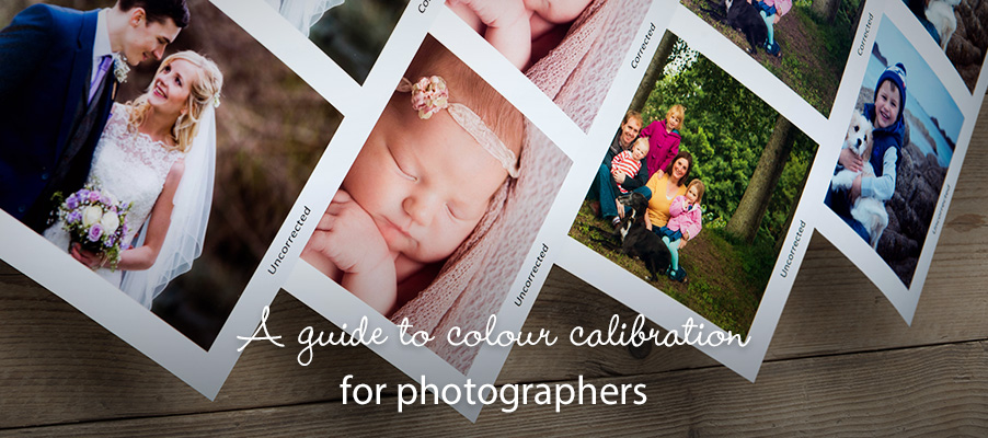
In order to demonstrate the difference that our free colour correction service can make, we’ve included one image that reflects a ‘before’ and ‘after’ in the colour correction process.
Free Test Prints
Our free test print service provides up to five prints, both with and without colour correction, so you can also compare and decide if the complimentary colour correction service is for you.
For best results, submit a test print order containing a range of images which cover a wide spectrum of colours. We also recommend you include a B&W image, as these can help with any density adjustments you may need to make.
Totally free, use our free test print service to find out how different your colours are!
*Complimentary Colour Correction is available across all products excluding the Classic Coffee Table Book, Preview Books and Photobooks.